


Client: Procter & Gamble | Company: Capita | Role: Lead UX/UI Designer | Product: Website
P&G Pension Scheme
Procter & Gamble didn't have an online presence to communicate their pension scheme to its members. They were relying solely on print materials so I was tasked with creating a website that houses all of the key information.

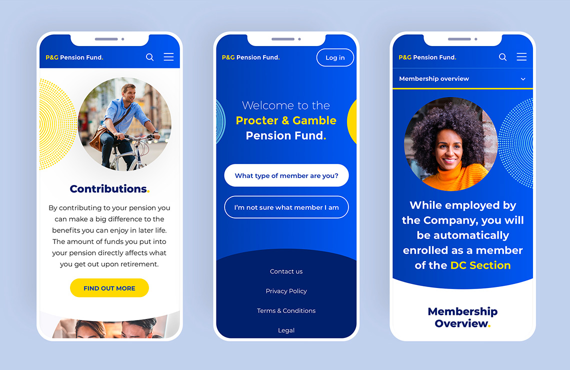
Using their existing brand guidelines I used various elements to create a new sub-brand 'P&G Pension Fund'. The aim was to make this distinct from the main brand but still obvious it is part of it. This included a simple logo and embracing the circular shapes and the many patterns and colours.

We used P&G's printed member booklets as a basis of the content for the site. The key was to make the information work well online with a clear structure around the 3 member types, Active, Deferred and Defined Benefit.

As the content varies for each member type, I created a portal entry page in which you make your selection. This then takes you to your specific version of the site, landing on a page that outlines your 5 key decision points around your pension. We also included a pop up sign up screen to communicate with members digitally.


I created a bright and engaging visual style that brings warmth to the subject matter, trying to inspire people to get more involved with their pension. The content is broken down with tabs and is kept engaging with the use of graphs, imagery, infographics, and subtle animations.


The site works great across all devices and remains easy to use and navigate. This was helped with the use of a sticky sub-navigation.


